Vendasta Documentation
Your comprehensive resource for all Vendasta platform tools and features. Explore our documentation sections below to get started.
Explore by Product

Partner with AI to monitor your listings, reviews, mentions, and social media presence.

Respond to customer posts, uncover potential prospects, and discover relevant content.

Improve visibility online and within local maps and navigation apps.

Bring clients' ad campaigns under one roof to see what's working across platforms.
Launch, manage, and grow WordPress websites.
Quick Start Resources
New to Vendasta? Here are your essential next steps:
- Intro to Vendasta - Start here to learn how to get the most out of your Vendasta experience.
- Partner Center Access - Log in to your Partner Center dashboard
- Vendasta Academy - Take courses to master the platform
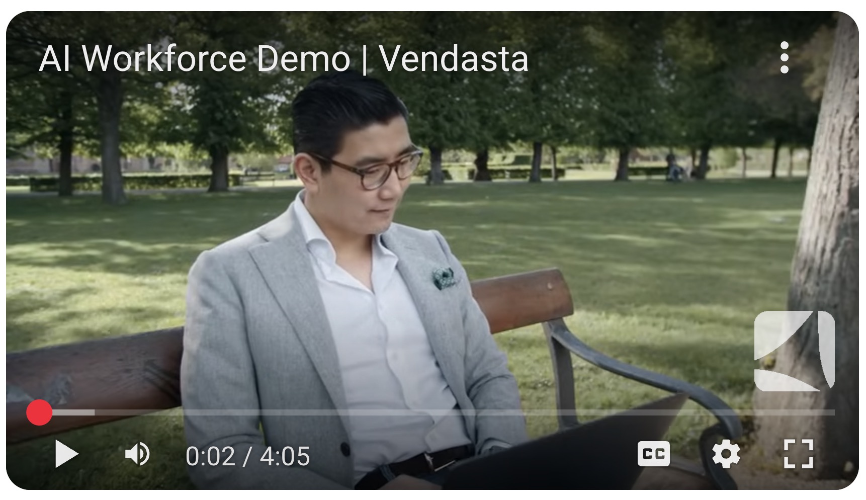
Vendasta YouTube Channel
Watch tutorials, discover new features, and hear customer stories.
- Sign into Partner Center
Access your dashboard and tools.
- Check system status
See real-time platform availability updates.
- API Documentation
Explore Vendasta APIs and integration guides.
- Join our Partner Community
Connect with other partners and share best practices.
- Contact Support
To contact support, email support@vendasta.com